Developing a great product relies on two fundamental principles. The first one is analytical: measuring any significant action in detail and thoroughly understanding what users do (and don’t do). At the same time, the analytical aspect should be complemented by an equal degree of emotional understanding: how to make users relate to your product and love it, how to get them excited, get them to laugh and undergo experiences while using the product.
In the case of most products, unlike programs and applications, this was already understood decades ago. Take cars for example. On the one hand, they should obviously function mechanically and drive well, but it is equally important for a car to have an emotional effect, whether it is making the owner feel like an excellent family man who takes the utmost care to secure his family’s safety, or like a young rebel embarking on an adventure. For some reason, while almost every conceivable product is imbued with an emotional experience, it remains rare to find software products which, besides being functional, also make us feel something.
I gave the talk: Products Have Feelings Too for the first time over three years ago at the first Reversim summit. Besides my first talk ever (which took place a few months earlier), this was probably the speech I was most nervous about. Reversim is a super-technical convention for developers. After a series of practical talks, I found myself preparing to speak to a few hundred developers (no offense, but developers are definitely the most critical audience ever) about…feelings. After a few creative attempts at avoiding this talk, I faced the challenge with courage, only to discover that even the toughest audience yearns for more emotion, humor and experiences from their products. Since then, I have given this talk several times and was amazed to find the extent to which this topic touches listeners. Now, while I am entirely engrossed in designing the Oribi product, I find myself returning to the design of experiences and emotions. I am developing a data and analytics product, traditionally displayed in numerous tables, and making it… exciting.
Why every product should generate experiences
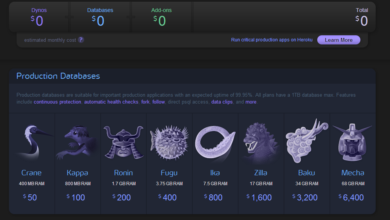
I had my ‘a-ha’ moment about integrating emotions into experiential product management when I encountered one of the first versions of Heroku. Until then, I thought it made sense to integrate an emotional aspect into software dealing with aspects like music or dating, but not the more ‘bland’ issues: serious, B2B, technologically complex products. Heroku is a cloud platform, which is as bland as it comes. The basic design with which the product was launched, and which helped it gain a significant market share, was inspired by Japanese mythology (yes, you’ve heard me right). The company’s entrepreneurs took this concept all the way: – deep purple tones throughout the application, cherry blossom animation when you launch a new server, package pricing based on Japanese mythological gods and We’re Hiring pages bearing Japanese warrior names and characters. Just imagine the extent to which your user experience is enhanced when success in launching a new server is indicated by the figure of a growing tree; when you’re not merely paying $1,600 per month, you’re paying for the powerful Godzilla package, or when you show interest in the Samurai developer position.
We all love to feel, laugh and imagine; it is an inseparable part of our life and there is no reason it should not be integrated into software products. This is where product managers should learn from marketing, films, and even reality shows.
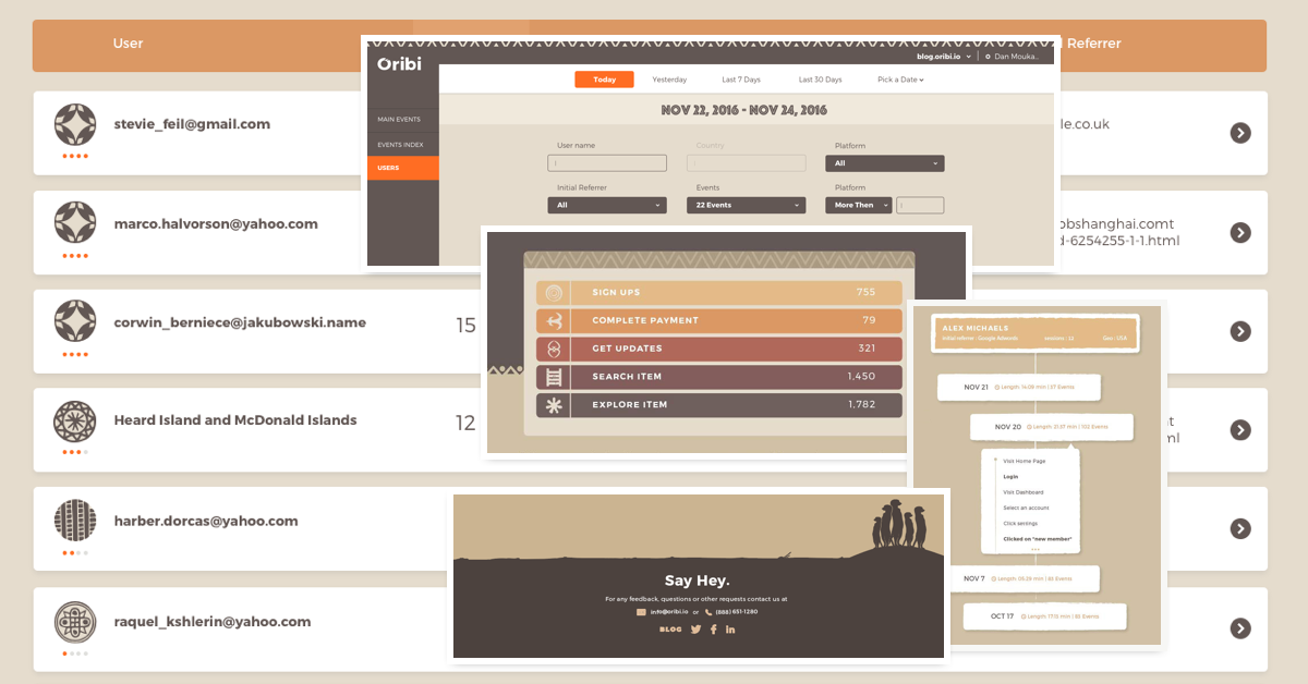
So let me say a few words about the two primary products I’ve been working on over the past few years, which have come to life using emotions. My two last startups are super ‘bland’ and some may even say boring. Takipi (today OverOps), deals with monitoring code in a production environment. Not something particularly memorable or relatable. We have managed to create amazing branding using monster characters representing bugs. To this day, Takipi is recognized as ‘the company with the monsters’. At Oribi, we are developing a BI/analytics product that focuses on providing a simple way to collect information, without being dependent on programmers. The most important emotion I want the product to express is simplicity. It is difficult to find information in most BI/analytics tools, which have hundreds of tables and numerous integration processes. Oribi is a simple analytics tool. I chose to imbue Oribi with an African character; to return to a primordial, tribal, almost primitive place and see how information is linked to basic, primal processes. I hope that we will manage to express the primitive sentiment, the sounds and colors of Africa, and this primordial feeling in the product we develop.
Finding the product’s magic moments
The real art in building a strong emotional connection to the product is identifying the point at which emotion should be integrated. I often get raised eyebrows when I tell people about choosing an African theme for Oribi; I need to constantly ‘apologize’ and explain that we do not intend to replace graphs with jumping zebras, but rather work with a touch of a simpler, more primitive language. I believe that the product’s unique, humorous and distinctive components must be manifested on the critical and most exciting occasions: completing installation, notification of a significant modification or completing a purchase. The best products are usually simple and almost standard, other than when the user encounters new, significant or challenging things.
The key question the product team must ask itself is “what is our product’s magic moment?”
In today’s reality, when most products are free and users have an extremely short attention span, the product’s value must be evident quickly, and it should elicit a strong emotional response. This does not necessarily mean that you must put on a show or have characters, but simply that you should highlight this moment and make it shine. Here are some examples from products I have worked on:
- The first product I managed, AutoCAD 360, is a mobile+web version of the long-serving program. The magic moment here was obvious: That moment when users see their own complex drawings on their mobile device, with an excellent display and editing experience, created the connection to the product. One of the most challenging and complex decisions I have ever made regarding a product was to prevent new users from creating a new drawing from scratch. In order to see their drawing, users had to upload it from their computer or email it – not a lot a work, but on the matter of a short attention span, this could obviously be the case. What would usually happen is that new users would start a new drawing, scribbling a few meaningless lines and circles; clearly not a magic moment. By blocking the option to create drawings from scratch, we had lost some new users, but managed to raise the overall number of engaged users by leading more users to the magic moment.
- The first product I managed, AutoCAD 360, is a mobile+web version of the long-serving program. The magic moment here was obvious: That moment when users see their own complex drawings on their mobile device, with an excellent display and editing experience, created the connection to the product. One of the most challenging and complex decisions I have ever made regarding a product was to prevent new users from creating a new drawing from scratch. In order to see their drawing, users had to upload it from their computer or email it – not a lot a work, but on the matter of a short attention span, this could obviously be the case. What would usually happen is that new users would start a new drawing, scribbling a few meaningless lines and circles; clearly not a magic moment. By blocking the option to create drawings from scratch, we had lost some new users, but managed to raise the overall number of engaged users by leading more users to the magic moment.
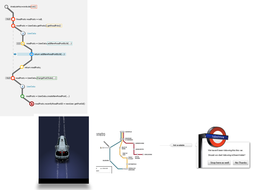
The first sketches of designing the ‘voyage’ through the code 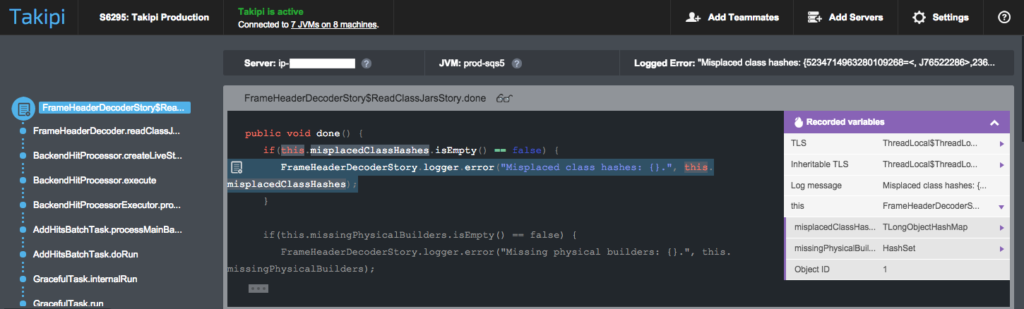
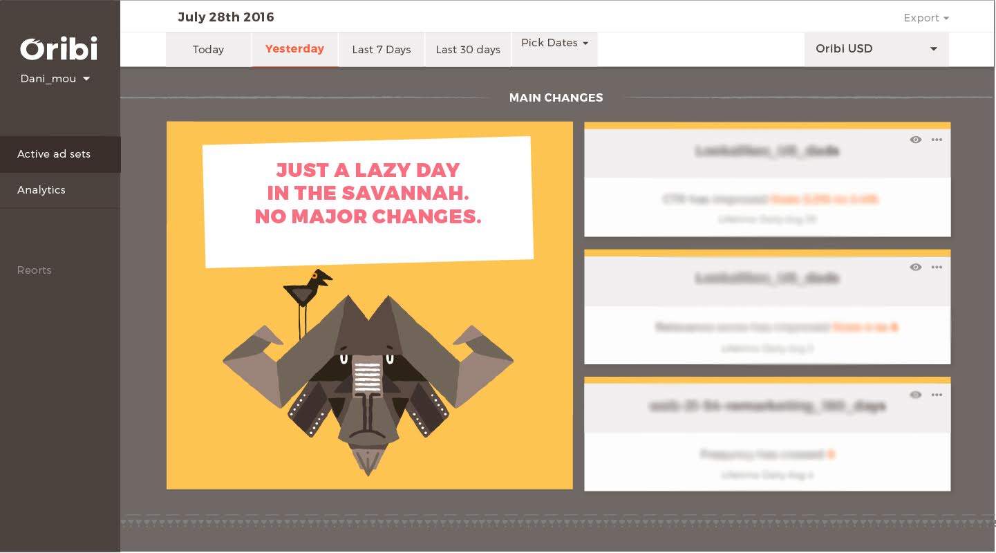
And its development over the years - At Oribi, we have been developing a simple analytics tool. In this context, ‘simple’ has various meanings, but one of the primary ones is that there is no need to analyze the information and go over various graphs to see what has changed; our concept in Oribi, and one of the product’s magic moments, is receiving notification of substantial changes. This is an example from one of the Oribi screens indicating whether any significant changes occurred that day or whether everything was as usual. Similar to other products, while most of the design is clean and standard, here we chose to present a daily summary using animals: if you see a sleepy Gnu during your daily sign-in to the product, there isn’t much new, while a surprised monkey is indicative of significant changes, and of course there are a number of animals in between. We wanted to turn this moment in the morning, when you go into the dashboard to check what happened yesterday, into an experience.

Give your users something real to relate to, not a product
A little clarification is due: all the examples in this post intentionally include ‘boring’ products. No Apple, Facebook or any ‘cool’ products. I’ve been trying to show that you can integrate emotions into any product.
Humans are social beings. We relate to people, animals and characters, rather than companies and organizations. Take a moment to think about the brands you’re attached to; almost all of them revolve around a character, real or fictional, a man or a creature. Take cornflakes for example, no, people are not capable of emotionally connecting with small flakes of sugar-frosted corn. Kellogg’s have developed their iconic tiger, the Israeli company Telma helps consumers relate to their cornflakes using famous basketball players, while the Israeli cereal brand, Fitness builds this connection using fitness trainers and other fitness-oriented women.
These very same methods also work for technical products. People find it extremely difficult to relate to a collection of features. The following are examples of software products that have developed fascinating emotional branding:
MailChimp
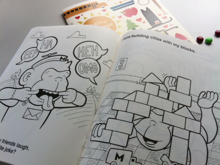
I mention MailChimp as my first example because it is considered to be one of the only products to have won a specific market by using great UI and making users relate to the product. MailChimp entered the highly saturated market of email automation, which already had many dominant players. The company founder and entrepreneur is an industrial engineer by education, who had built the product around the emotional side of sending emails. The product’s trademark is a mailman chimpanzee named Freddie. The product uses numerous variations of this character – a flat image, a huge doll, a plastic look and more. One of their most successful campaigns included a give-away of chimpanzee hats for cats (yes, you’ve got it right). Another campaign included children’s coloring pages of the famous chimp in different situations.
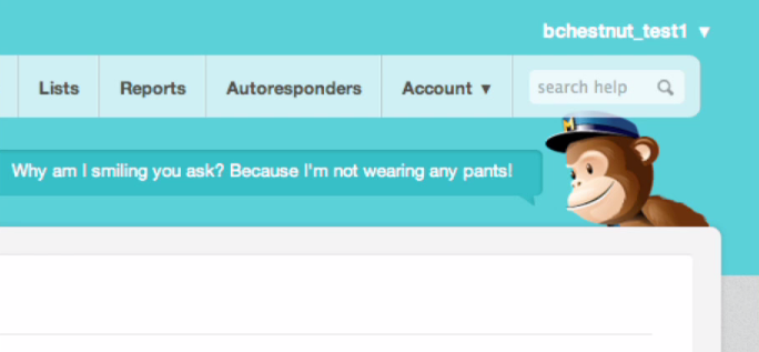

A great talk by Ben Chestnut about MailChimp, creativity and humor in products
GitHub
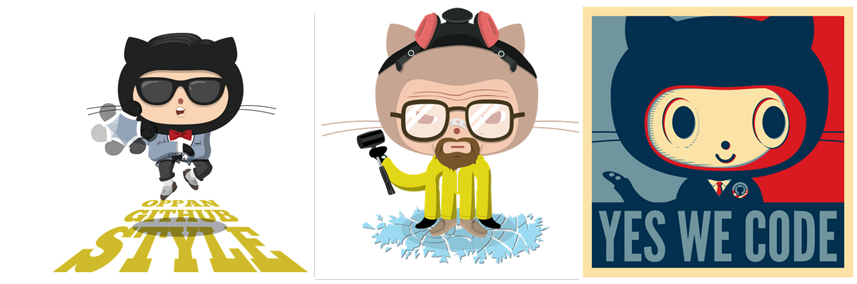
GitHub use different humorous variations of the company’s logo, the Octocat, a cat/octopus. GitHub’s website includes a section devoted to different versions of the Octocat. The Octocat is remarkable for the various ‘costumes’ it wears, which enable it to accommodate any occasion: elections, holidays, feature launches and more.
Takipi
Takipi (today OverOps) definitely belongs in the ‘boring’ product list: debugging, developers and servers. Don’t get me wrong, I believe that companies with boring products are much more likely to become successful. At the same time, they also create complex marketing and product challenges. How do you make potential users relate to a product and remember the company?
Even during Takipi’s first days, it was clear that we needed to create a fun, memorable side to the product. Many ideas were rejected: from moles burrowing through the code to books relating the story of a code excerpt.
One of the ways which help me stay focused during long technical discussions, is scribbling sketches in my notebook and, during one discussion on support for multi-threaded debugging I came up with this creature:
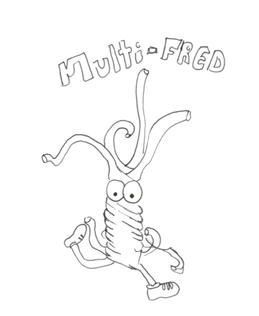
The team quickly grew to like Multi Fred, leading to the creation of a ‘monster’ collection, each representing a different bug type. It is important to clarify – it is difficult to find one theme which every potential user will find relatable. Okay, so some users might not think it’s particularly funny and others may consider it a bit childish. However, they all remember the company, they are all touched in one way or another, and it is a great way to overcome all the surrounding environmental noise, and reach people. It was amazing to see how only a few weeks after building the brand, Takipi came to be recognized as ‘the company with the monsters’. Here are some examples of the use of ‘monster-speak’:
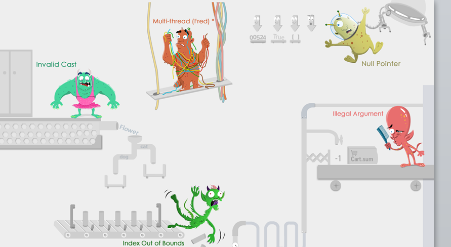
- some examples of the use of ‘monster-speak’:
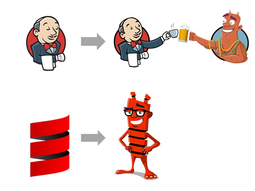
- This ‘monster language’ was used on the main site, the landing pages and the company blog, and it was used a bit differently in each place. In fact, one of the nicer uses involved integration with other products. For example, when we started supporting Scala (for those not yet familiar, Scala is a relatively new programming language) we added a ‘Scala monster’, which was based on Scala’s logo, to our primary monster set. We managed to form a strong connection with the Scala community through this creature, and within days of the product (and the matching monster) being released, the original creators of Scala emailed us requesting a t-shirt depicting the monster. Another example involved supporting integration with Jenkings. We mashed up our logo with Jenkins’ English butler logo.
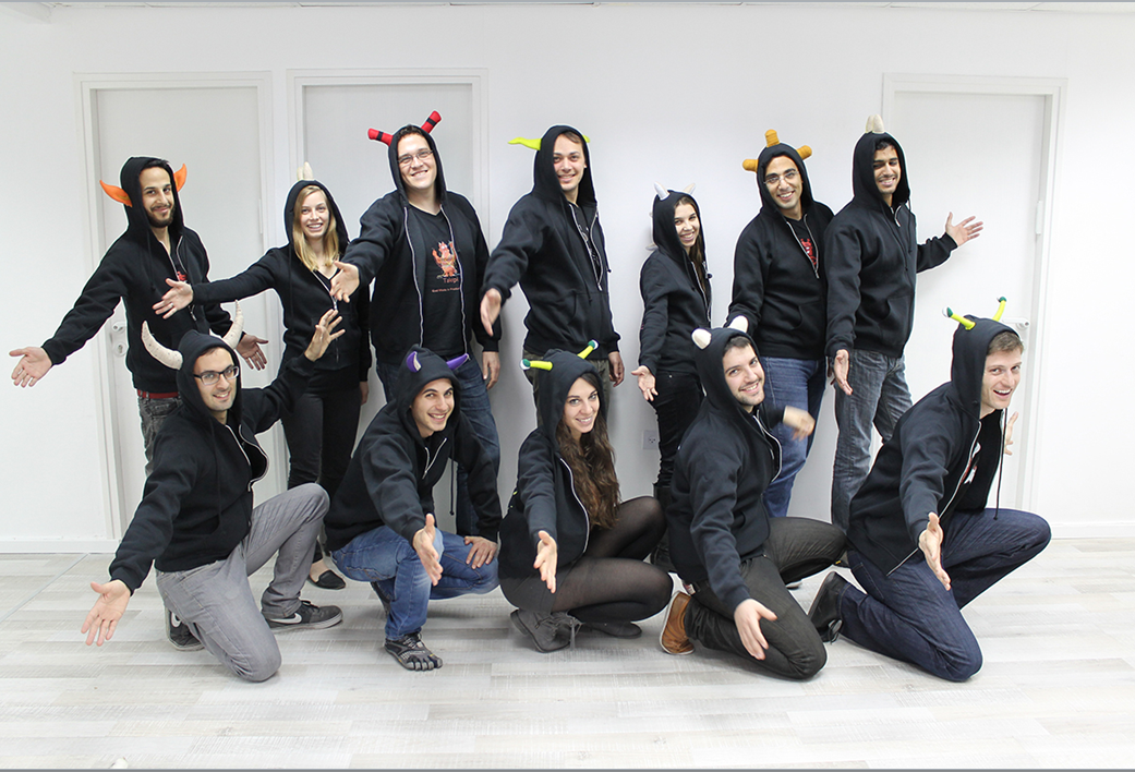
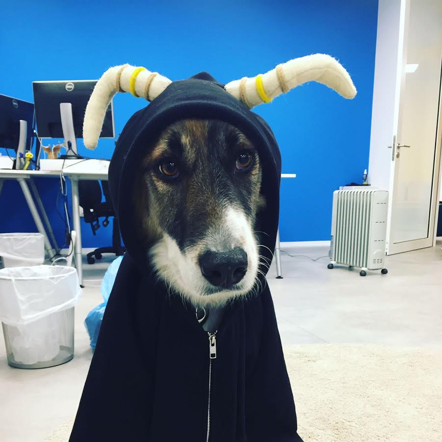
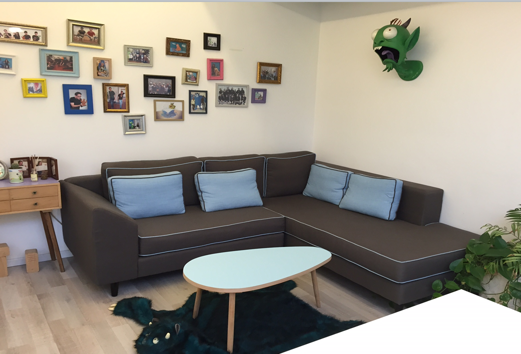
- After a few months, ‘monster-speak’ started penetrating the company’s own branding. We managed to develop a strong company identity around these characters. This was evident, for example, in the ‘Takipihoodies’ – hoodies with Takipi monster horns. I’ve continued this tradition in Oribi, with hoodies with various kinds of impala horns. The interior design of the office includes monster prints, a monster carpet, a monster-shaped moose head and even monster slippers.
- Another interesting example of using emotional language and emotions was a photograph, containing monster humor, we prepared for each employee during their first week at work. It helped create a feeling among new employees of belonging to the company, as well as generating a buzz around the company, a unique way of telling everyone that we are growing.
- The following is an example of the way the African language is applied in Oribi’s branding. This is how we chose to present our employees in our About Us page. I don’t think explanations are actually necessary 🙂
And at Oribi with the house model Marley

Overcoming the product’s challenging moments using emotions and humor
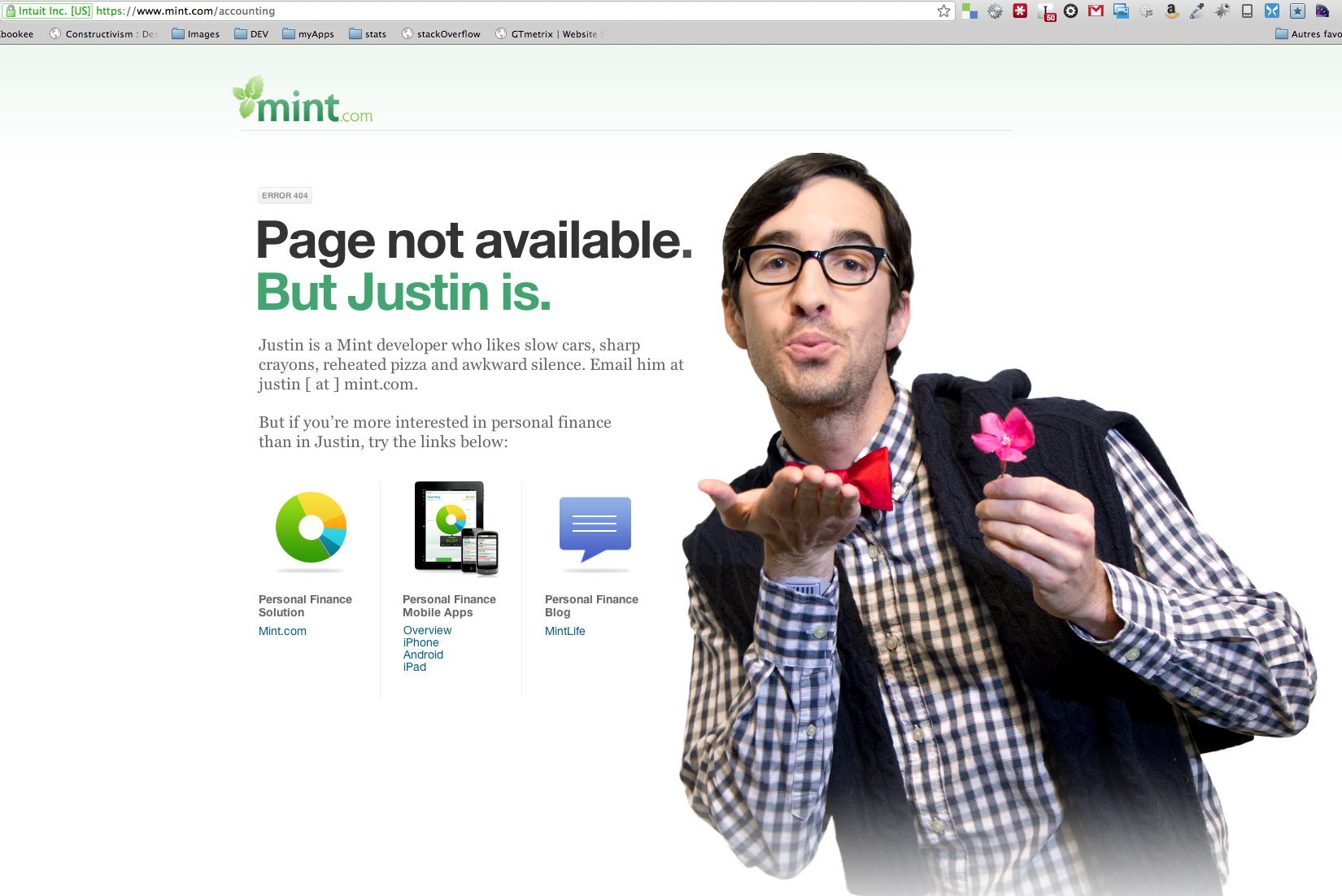
- I believe that good product managers should invest most of their resources in the stages of the funnel where most user leaks occur, – whether it is the registration process, the need to install a certain component, making a user return to the product for the second time or convincing a free user to pay. This is the stage when making a user feel something or smile significantly improves the odds of him going through this challenging moment. Some of the most common examples are 404 pages – the place where you have ‘lost’ the user and he or she is most likely to close your site’s tab. Note that even the most serious, high-brow companies still use a lot of humor in their 404 pages. To some extent, since companies know that the user is ‘lost’ at this stage, they allow themselves to be more at ease and leave the user with a good feeling. I am sure that the 404 pages that have made you smile (and certainly those that raised a big smile), also made you stay on the site and search for your destination again.
- Signup is a challenging stage during which many potential client leaks occur. This is an example of a small touch that connects the user to the product as early as the signup stage.

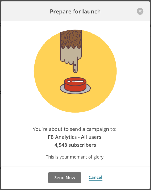
- A charming example from MailChimp that makes me smile even after seeing it a hundred times. In the last section, I talked about each product’s magic moments, but there are also the antithetical moments – stressful and alarming. MailChimp did a great job capturing the moment before a newsletter is sent to hundreds or thousands of people, when you must have the guts to press the button while being concerned that the newspaper might contain mistakes and that thousands of people are about to get inaccurate information. MailChimp uses an animation of their iconic chimp who, with a sweat-soaked hand, prepares to push the button; in this way they generate a funny sense of identification that makes overcoming this unpleasant step a friendlier experience.
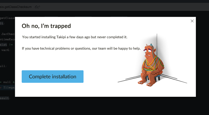
- And a last example from Takipi – the most challenging step in the funnel was the stage in which users had to install an agent on their server. Although the installation itself takes less than a minute, this step is much more demanding than other parts of the installation. We chose a mildly ‘guilt-tripping’ approach, and used the monster character. Instead of sending nagging emails requesting the user to complete the installation, we chose to tell a story about Fred the monster who is stuck in the middle of nowhere, alone, in the dark – because you started but did not complete the registration process. These emails were filled with humor and told a story, helping us increase the number of users completing the installation by a few percent.
- Currently I am working on generating emotion and identifying magic moments in Oribi, while we complete our initial beta phase. This situation is a source of fascinating tension between the world of Big Data, complex algorithms and analytics, and graphics and UI oriented at a simple, tribal and primordial feeling. More details and stories will appear on the next posts.