Building a great product relies on two fundamental principles. The first one is analytical: measuring any significant action in detail and thoroughly understanding what users do (or don’t). The analytical aspect must be balanced by an equal degree of an emotional aspect: how to make users relate to your product and love it, how to get them excited and even laugh.
In the case of most ‘real world’ products, unlike programs and applications, this was already understood decades ago. Take cars for example. On the one hand, they should obviously function mechanically and drive well, but it is equally important for a car to have an emotional effect, whether it is making the owner feel like the perfect dad who takes the utmost care to secure his family’s safety, or like a young rebel embarking on an adventure. For some reason, while almost every conceivable product has an emotional experience, it remains rare to find software products which, besides being functional, also make us feel something.
Why products should generate experiences
My ‘a-ha’ moment about integrating emotions into software products was when I encountered one of the first versions of Heroku. Until then, I thought it made sense to add an emotional aspect into an ‘existing’ software dealing with aspects like music or dating, for example. I never thought about it in the context of ‘serious’, B2B, technologically complex products. Heroku is a cloud platform, definitely on the ‘boring’ side of the products spectrum. The basic design with which the product was launched, and which helped it gain a significant market share, was inspired by Japanese mythology (yes, you’ve heard me right). The company’s entrepreneurs took this concept all the way: – deep purple tones throughout the application, cherry blossom animation when you launch a new server, pricing packages based on Japanese mythological gods and “We’re Hiring” pages bearing Japanese warrior names and characters. Just imagine the extent to which your user experience is enhanced when launching a new server is indicated by the figure of a growing tree; when you’re not just paying $1,600 per month, but rather paying for the powerful Godzilla package, or when you show interest in the Samurai developer position.

We all love to feel, laugh and imagine; it is an inseparable part of our life and there is no reason it should not be integrated into software products. This is where product managers should learn from traditional marketing, films, and even reality shows.
A few words about the two primary products I’ve been working on over the past few years, which have come to life using emotions. My two last startups are super ‘bland’ and some may even say boring. Takipi (today OverOps), deals with monitoring code in a production environment. Not something particularly memorable or relatable. We have managed to create amazing branding using monster characters representing bugs. For a long while, Takipi was recognized as ‘the company with the monsters’. At Oribi, we’re developing an analytics product that focuses on providing analytics for everyone, not just Analysts. It means we’re creating a data-oriented product – but easy to use, not techy and friendly. The most important emotion I want the product to express is simplicity. I chose to imbue Oribi with an African character; to return to a primal, tribal, almost primitive place and see how information is linked to basic, primal processes.
Finding the product’s magic moments
You can’t (and don’t want to) create an emotional experience throughout your entire app. The art in building a strong emotional connection to the product is identifying the right points and creating the spark there. The best products are mostly simple and almost standard, other than when the user encounters new, significant or challenging things.
The key question the product team must ask itself is “what is our product’s magic moment?”
In today’s reality, when most products are free and users have an extremely short attention span, the product’s value must be evident quickly, and it should evoke a strong emotional response. This doesn’t necessarily mean that you must put on a show or use illustrated characters, but simply that you should highlight this moment and make it shine. Here are some examples from products I have worked on:
- The first product I managed, AutoCAD 360, is a mobile+web version of the long-serving program. The magic moment when users see their own complex drawings on their mobile device, with an excellent display and editing experience, is the moment that creates the connection to the product. One of the most challenging and complex decisions I have ever made regarding a product was to prevent new users from creating a new drawing from scratch. In order to see their drawings, users had to upload it from their computer or email it – not too much work, but on the matter of a short attention span, it’s a lot to ask. But, without this limitation, most users didn’t experience the magic moment. What would usually happen is that new users would start a new drawing, scribbling a few meaningless lines and circles; clearly not a magic moment. By blocking the option to create drawings from scratch, we had definitely lost some users, but managed to raise the overall number of engaged users by leading more users to the magic moment.
- At Takipi, we developed a technology enabling developers to see exactly what causes production code exceptions. The product’s magic moment was watching the code run until the ‘explosion point’. I wanted to emphasize the concept of ‘going through’ the code and the ability to easily ‘stop’ at any station. Our initial design was inspired by Metro maps, to create an association of traveling, in this case, through stations of your code. While most applications have a clean and solid design, I chose to use an unusual element here, to convey the ‘magical’ feeling. To this day, after many product changes, the ‘metro’ element is still a key part of the UI.
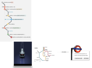
The first sketches of designing the ‘voyage’ through the code

And its development over the years
Give your users something real to relate to, a product is not enough
A little clarification is due: all the examples in this post are of ‘boring’ products. No Apple, Facebook, Pinterest or other ‘cool’ products. I want to show it’s possible to bring emotions into any product, even the ‘boring’ ones.
Humans are social beings. We relate to people, animals, and characters rather than companies and organizations. Take a moment to think about the brands you’re attached to; almost all of them revolve around a character, real or fictional, a man or a creature. Take cornflakes for example, no, people are not capable of emotionally connecting with small flakes of sugar-frosted corn. Kellogg’s have their iconic tiger, another brand is using famous basketball players, and Fitness builds this connection using fitness trainers.
These very same methods also work for technical products. People find it extremely difficult to relate to a collection of features.
The following are examples of software products that have developed fascinating emotional branding:
MailChimp
I mention MailChimp as my first example because it is considered to be one of the only products to have won a specific market by designing a great UI and making users relate to the product. MailChimp entered the highly competitive market of email automation, which already included many dominant players. The company founder and entrepreneur is an industrial engineer, who had built the product focusing on the emotional side of sending emails. The product’s trademark is a mailman chimpanzee named Freddie. The product uses numerous variations of this character – a flat image, a huge doll, a plastic doll and more. One of their most successful campaigns included a giveaway of chimpanzee hats for cats (yes, you’ve got it right). Another campaign included children’s coloring pages of the famous chimp in different situations.


A great talk by Ben Chestnut about MailChimp, creativity, and humor in products
GitHub
GitHub uses different humorous variations of the company’s logo, the Octocat, a cat/octopus. GitHub’s website includes a section devoted to different versions of the Octocat. The Octocat is remarkable for the various ‘costumes’ it wears, which enable it to accommodate any occasion: elections, holidays, feature launches and more.

Takipi
Takipi (today OverOps) definitely belongs in the ‘boring’ product list: debugging, developers and servers. Don’t get me wrong, I’m not against ‘boring’ companies, they are much more likely to become successful. But, their marketing and product challenges are bigger. How do you make potential users relate to a ‘boring’ product and remember the company?
Even on Takipi’s first days, it was clear that we needed to create a fun, memorable side to the product. Many ideas were rejected: from moles burrowing through the code to books relating the story of a code excerpt.
One of the ways which help me stay focused during long technical discussions is doodling sketches in my notebook. During one discussion on support for multi-threaded debugging I came up with this creature:

The team quickly grew to like Multi Fred, leading to the creation of a ‘monster’ collection, each representing a different bug type. It’s important to clarify – it is difficult to find one theme which every potential user will relate to. So, some users might not think it’s particularly funny and others may consider it a bit childish. However, all of them will remember the company and will be touched in one way or another.
It was amazing to see how only a few weeks after building the brand, Takipi came to be recognized as ‘the company with the monsters’. Here are some examples of using the monsters which helped us to increase engagement:

- This ‘monster language’ was used on the main site, the landing pages, and the company blog, and it was used a bit differently in each place.
- One of the fun uses involved integration with other products. For example, when we started supporting Scala (for those not yet familiar, Scala is a relatively new programming language) we added a ‘Scala monster’, which was based on Scala’s logo, to our primary monster set. We managed to form a strong connection with the Scala community through this creature, and within days of the product (and the matching monster) being released, the original creators of Scala emailed us requesting a t-shirt depicting the monster. Another example involved supporting integration with Jenkins. We mashed up our logo with Jenkins’ English butler logo.

- After a few months, the monsters started penetrating the company’s branding. We managed to develop a strong company identity around these characters. This was evident, for example, in the ‘Takipihoodies’ – hoodies with Takipi monster horns. I’ve continued this tradition in Oribi, with hoodies with various kinds of impala horns. The interior design of the office includes monster prints, a monster carpet, a monster-shaped moose head and even monster slippers.


- Another interesting example of using emotional language and emotions was a photograph, containing monster humor, we prepared for each employee during their first week at work. It helped create a feeling among new employees of belonging to the company, as well as generating a buzz around the company, a unique way of telling everyone that we are growing.
- The following is an example of the way the African language is applied in Oribi’s branding. This is how we chose to present our employees on our About Us page. I don’t think explanations are actually necessary 🙂

Overcoming the product’s challenging moments using emotions and humor
I believe that good product managers should invest most of their resources in the funnel stages where most user leaks occur, – whether it’s the registration process, the need to install a certain component, making a user return to the product for the second time or convincing a free user to pay. It is at this stage, that making a user feel something or smile, significantly improves the odds of him going through this challenging moment. The best example is 404 pages – the place where you have ‘lost’ the user and he or she is most likely to close your site’s tab. Note that even the most serious, high-brow companies still use a lot of humor in their 404 pages. To some extent, since companies know that the user is ‘lost’ at this stage, they allow themselves to be more at ease and leave the user with a good feeling. I am sure that the 404 pages that have made you smile (and certainly those that raised a big smile), also made you stay on the site and search for your destination again.

Completing the signup form is a challenging stage, during which many potential clients are lost. This is an example of a small touch that connects the user to the product as early as the signup stage.

A charming example from MailChimp that makes me smile even after seeing it a hundred times: MailChimp did a great job capturing the moment before a newsletter is sent to hundreds or thousands of people, where people get to the ‘no-return’ stage before sending out a newsletter to thousands of people. MailChimp uses an animation of their iconic chimp who, with a sweat-soaked hand, prepares to push the button; in this way, they generate a funny sense of identification that makes overcoming this unpleasant step a friendlier experience.

And one last example from Takipi – the most challenging step in the funnel was the stage in which users had to install an agent on their server. Although the installation itself takes less than a minute, this step is much more demanding than other parts of the installation. We chose a mildly ‘guilt-tripping’ approach and used the monster character. Instead of sending nagging emails requesting the user to complete the installation, we chose to tell a story about Fred the monster who is stuck in the middle of nowhere, alone, in the dark – because you started but did not complete the installation process. These emails were filled with humor and told a story, helping us increase the number of users completing the installation by a few percent.
