Back when I took my first steps in marketing, Apple’s site was my go-to reference. In those days, this website was considered the world’s best website. It was common practice to imitate their visuals, navigation bar’s UI, the content.
It took me just a couple of months to realize how absurd it is to emulate Apple. Most of their visitors landed on a website of a company they already know and love. They saw the brand multiple times before and, usually, have very high intent. My website visitors know little to nothing about our product, rarely manifest any intent, and don’t give us too much credit. There is absolutely no correlation between Apple’s best practices and what will help us attract and convert leads.
But why am I telling you about the Apple website in this post?
It took several years for me to understand that to run the traditional A/B test is to practically make the same sort of mistake over and over again. A/B testing is a methodology that—at its base—works well with companies that have online traffic in the masses and a solid business core. The problem started when this methodology started trickling down to startups and other organizations that are far from falling under these 2 criteria.
While I (and all other startups) was busy testing CTA colors, button labels, or a particular visual – the battle was already won. You need endless traffic, tens of thousands per month at least, to draw the correct conclusions. Also, you need to measure the performance of every step in the funnel. This means that—apart from high-volume traffic—you must also gain at least a couple of hundred conversions (usually it translates to paying customers) for the test to run correctly. For example, if you test the registration button’s copy to ‘Try it for free,’ you may experience a much higher click rate, but it won’t convert more users/viewers into customers at the end of the day (or funnel).
And, if we’re being completely honest, the vast majority of A/B tests have little to no effect on your bottom line. I mean, changing your button’s color from red to orange can absolutely increase your conversion rate by 1%. But if you don’t work for an enterprise, this increase is not a game-changer. It might not justify the budget you spent on testing, verifying, measuring across the funnel, etc.
So How Do You A/B Test if You Don’t Have a Lot of Traffic?
Since A/B tests are better suited for high-volume traffic websites, their best practices revolve around minor tweaks: Button copy, images, CTA color, H1, button location. Sometimes it’s more elaborate, but we’re not talking about significant changes.
These tests, run on a website with monthly traffic of a couple of hundred or thousands of visitors, are almost impossible to measure. A 10% increase in favor of A, when we have 400 visitors, is only 40 people. This is not a difference substantial enough to pass the verdict.
My viewpoint on testing within a company that’s still in the growth stage is don’t A/B test, but rather A/Z test – run radically different variants. Granted, it takes a lot of extra work, but it can indeed lead to considerable optimization.
Let’s take a landing page optimization, for example. These days, the most common practice is to build a page, publish it, make sure it’s performing well (more or less), and then run tests for relatively minor variations. My credo is to start off with at least 3 pages, utterly different in design, flow, and messaging. In contrast to traditional A/B tests (where low-volume traffic makes it impossible to draw concrete conclusions), A/Z tests provide clear-cut results regardless of the audience size. When I detect that one of the pages performs significantly better, I start creating versions to run against it – and so on.
Think of it like a Guess the Character game (or, for the developers among us, a sorting algorithm):
You usually start with questions such as ‘am I a man or a woman?’, ‘am I a real character or not?’, ‘am I young or old?’. This basic information guides you in the right direction. I believe that—similar to the game—there is a ‘correct answer’ to what will convert better. And this is the best way to get to it. To continue with this metaphor, the way most marketers run A/B tests is like starting the game asking: ‘Am I a 55 or 56-year-old man?’, ‘am I a cartoon character that wears pink or red shorts?’. These marketers wrongfully assume that starting with the more fundamental questions distances you from the correct answer.
How to Begin A/Z testing?
I usually start with 3 super-different versions. From my experience, testing the messaging or the flow produces more actionable results than playing with design. I focus more on the message I’m conveying and the user journey than which colors or images I show them. Not that I don’t believe that design has an immense influence on the success of a funnel. It’s just that its importance is secondary to that of the message.
One of my favorite practices is to create a benchmark version. This version is built to measure how the more radical/unusual ideas perform compared to the more standard approach. For some companies, being out-of-the-box creative is less effective. I like following the suit of companies like Fiverr, Wix, etc. because I know they run endless tests on their websites. In some cases, the ‘benchmark version’ performs amazingly, and in others, the more creative approach wins.
… But This Is so Much More Time-Consuming
You’re dead right. Building 2 completely different pages takes much more time than just changing a button’s color. I think that choosing your battles is the key to any test you run. I focus almost solely on the more conversion-oriented pages, i.e., landing pages, homepage, pricing, and product pages. Treat your preliminary design process as a ‘pilot’ and don’t over-invest in it.
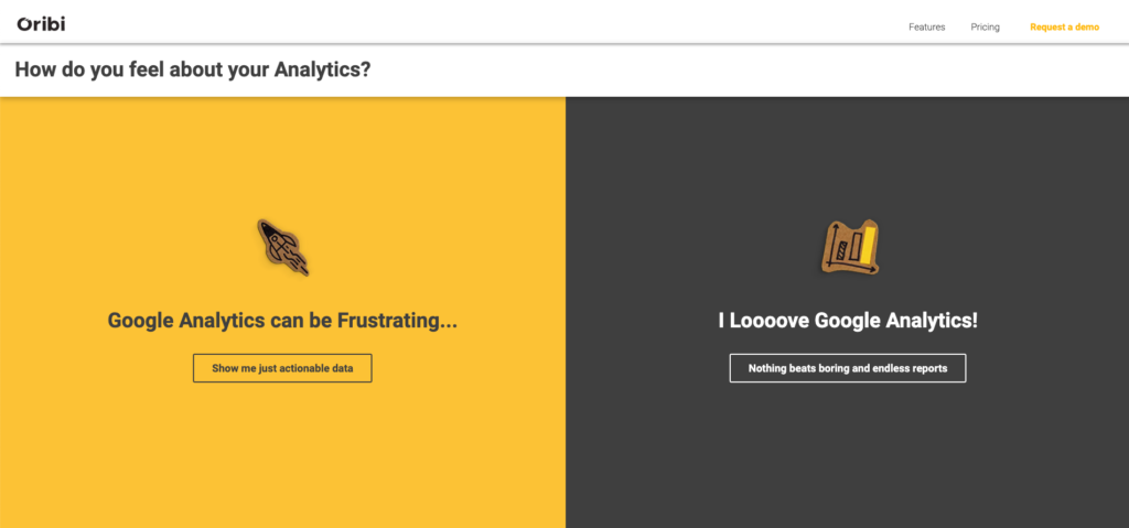
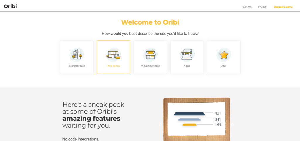
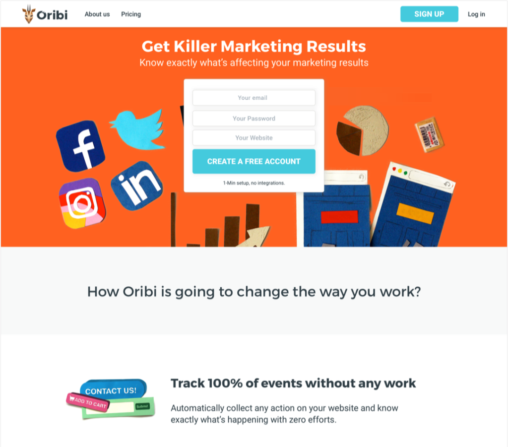
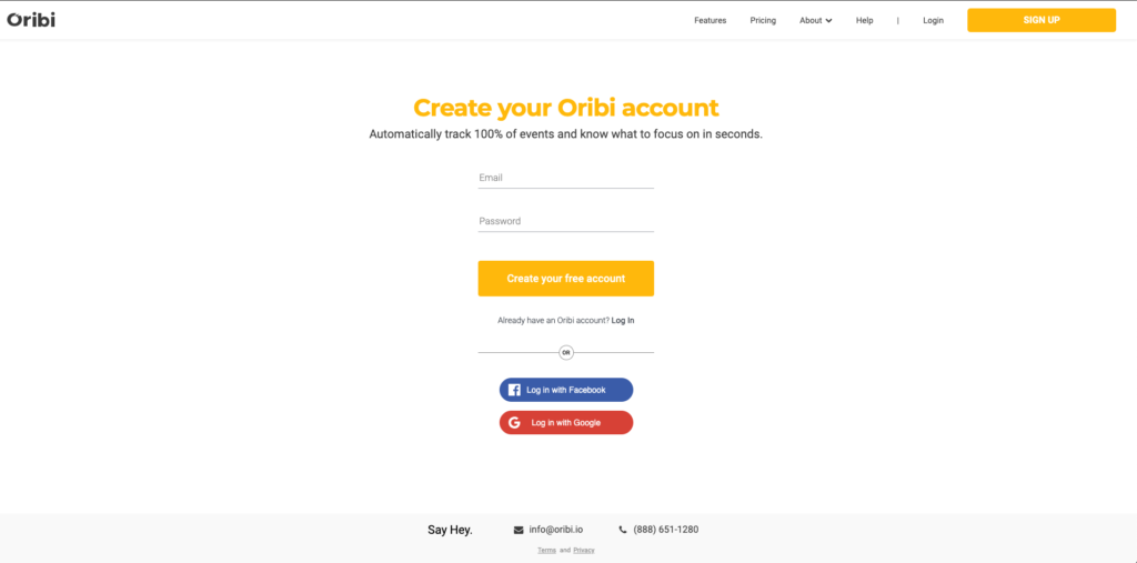
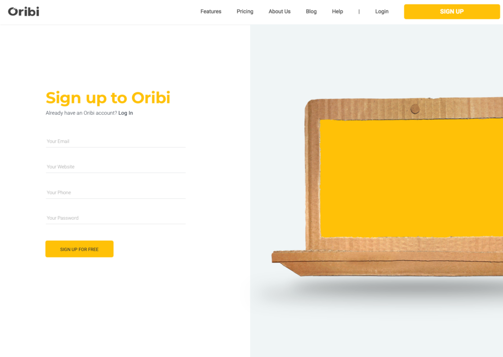
Here are a few landing page tests we ran:
 And here are a few flow tests we ran on the signup process:
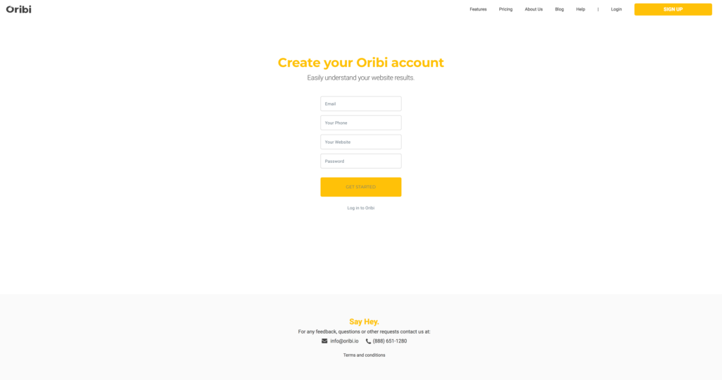
● A single form that includes all the fields
● Additional registration types and a multiple-step signup
● Product animation showcased side-by-side with the signup form
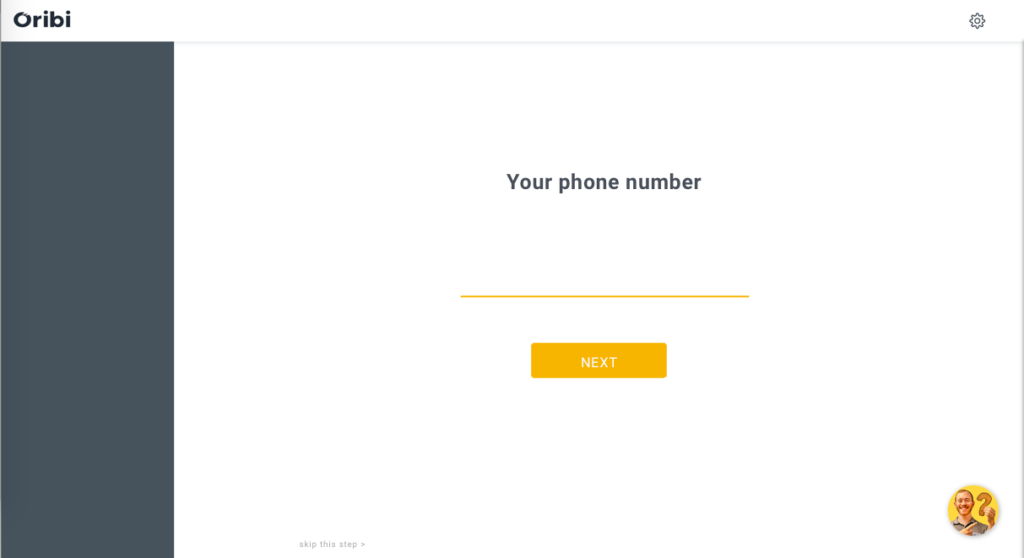
● Breaking the signup flow to one screen per step
Another strategy that saves me precious developing hours is to test the messages on Facebook Ads and email campaigns prior to on-site implementation. It’s much easier to produce a few images or short videos that carry super-different messages and run them one against the other. When we run these ad tests at Oribi, we see considerable differences in click-through rates and registration rates. I make sure to measure registrations and not put emphasis on the clicks. You can create a fascinating ad that will attract many clicks but not translate into conversions.
Here are a few examples of a few very different commercials that helped me test messaging:
Another viable way to check your messaging is by testing the subject lines of emails you send to your subscribers (a list of at least a couple of thousands of contacts will help you perform a more accurate test). In the next week, we’re launching a few features to cater to marketing agencies. We can use a few variants:
● Oribi can help you attract more clients
● Now you can finally communicate to clients the amazing work you’re doing
● A list of the new features (let them work out the benefits themselves)
Before I build a dedicated landing page, I intend to send 3 email versions with these messages (naturally, the list will be evenly divided).
I know what you think: If the message is the single most crucial element, why can’t I A/B test the H1?
Firstly, if you don’t have the budget to run more radical tests, this should be the first A/B test you’re running. It will yield substantial results, much more meaningful than any other test. Again, I would try 2 different approaches and not minor variants of the same message.
In order to check if your message works well, it needs to be represented throughout the entire page. For instance, at Oribi, one of our best-performing messages is “Say Goodbye to Old Analytics Tools.” If we only change the title, the rest of the page will be out of context. We need to echo the innovation on every single fold.
If you only change the H1 regardless of what lies underneath, your page may under-perform not because the message is not enticing but because there’s a context gap.
Split Testing Is Not an Absolute Must
Granted, it’s not far-fetched. However, one of the main elements that over-complicate optimization tests is the need for split testing. Split tests are done by routing 50% of your website traffic to version A and the other half to version B.
And, again, startups unnecessarily take a leaf out of the big enterprises’ book.
Measuring small iterations (promoting in different seasons, messaging tweaks, etc.) over a vast amount of traffic can help you draw truly important insight. But for a small organization with low-volume traffic – it’s just not as crucial.
Whenever I want to test a new version, I usually replace the old one (control) for a couple of days (without running both versions simultaneously) and compare the performance on an even time period. As long as no major discrepancies in segmentation are detected – the results are reliable. It allows me to draw conclusions much faster (since 100% of the traffic is referred to the new version) and saves me time-consuming tinkering with another tool for traffic routing.